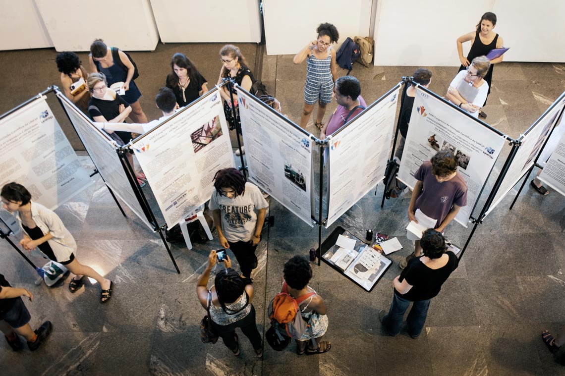
Displaying posters at academic events is a routine event for scientists and graduate students seeking to publicize their work, broaden their networks, and establish new partnerships. It is not, however, an easy task. The aim is to create a poster that is both functional and attractive, but in their attempt to divulge as much information as possible among their peers, many researchers fill their posters with charts, tables, and descriptions of procedures performed during their study. They often forget that informationally dense posters take a lot more time to read and to properly understand. The use of jargon and intricate titles can often alienate even those with a special interest in the topic.
A campaign launched on Twitter in June is trying to change the dynamics of these events and educate researchers by encouraging them to make more creative and easily readable posters. Posting under the hashtag #BetterPoster, the movement was launched by American scientist Mike Morrison, who is studying a PhD in psychology at Michigan State University. “Traditional posters are written like scientific articles,” Morrison told Pesquisa FAPESP. “They usually contain a summary, introduction, methodology, and conclusion. The format is then replicated at conference sessions, with dozens of posters to be read in just one hour by participants.”
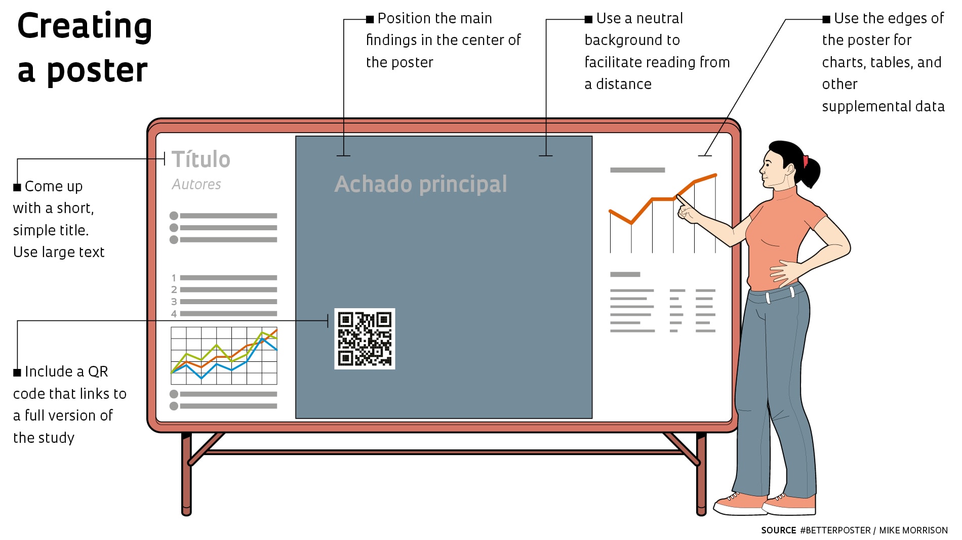
For Morrison, the ideal poster highlights the findings of a particular study. “The reader should be able to learn something in just 5 seconds by looking at the poster,” he says. “This encourages people to ask more specific and interesting questions than just asking the author to explain what their research is about.” In a video posted on YouTube when the campaign was launched, Morrison presented a new poster design.
In his suggested format, the most important result of the study is highlighted in the center of the poster, in large letters and simple language. Small supporting graphs and charts appear at the sides to help the researcher during his oral presentation. A QR code gives access to a copy of the poster and the full version of the study via a smartphone or tablet, for those interested. The model has been gaining support and is available to download for free at https://osf.io/ef53g/.
“It’s a simple but attractive layout,” says biologist Kelsey Picard, a PhD student at the University of Tasmania’s School of Natural Sciences in Australia. She incorporated some of Morrison’s recommendations into an award-winning poster at the STEM State Future Forum in September. The strategy, says Picard, was to focus on a short title composed of colloquial, irreverent, and vibrant language: “Plant ‘menopause’ may be triggered by the seeds.”
“The message caught the attention of many people,” says the researcher, who found that pea seeds send a signal “ordering” the plant to stop growing.
Despite the existence of online platforms such as Canva and Dribbble, which offer graphic design services for posters and other promotional materials, most researchers simply adapt posters produced by their colleagues. “It is common practice at universities and research institutions,” says Morrison. “Someone who has already created a poster sends the file over to a colleague, who replaces the information without changing the structure.” The practice shows how little scientists are concerned about the visual appearance of their presentations, Picard says. “There is a tendency to put as much information on the poster as possible, to try to impress your peers and show that you really did a lot of work,” acknowledges the biologist.
Getting the audience hooked
Martin Trauth, a geoscientist and scientific communications expert from the University of Potsdam, Germany, welcomes Morrison’s campaign, but warns: “Putting the key message of the research in the center of the poster is a great idea, but it doesn’t necessarily resolve all problems regarding the quality and amount of text.” According to the researcher, the most important thing is to provide a small sample of the study, a kind of “bait” to promote dialogue with the readers. But to achieve this, scientific conferences need to place more value on succinct displays. “Posters are often awarded prizes based solely on the content. The design is not even assessed,” says Trauth.
Pharmacist Laura de Freitas, a postdoctoral researcher at the University of São Paulo’s Institute of Chemistry (IQ-USP), believes the #BetterPoster campaign can have a positive impact on how posters are designed. “The size of the text, the choice of colors, and how figures are arranged are just as important as the content being presented,” said Freitas, who displayed a poster inspired by Morrison’s model at a recent conference. “I noticed a lot more people came to talk to me and asked me questions when I used this new format.”
Together with biologist Ana Bonassa, also a researcher at IQ-USP, she is part of the Vai lá no meu pôster (Go take a look at my poster) project, run by the Center for Research on Redox Processes in Biomedicine (REDOXOMA), one of the Research, Innovation, and Dissemination Centers (RIDCs) funded by FAPESP. The aim of the initiative is to disseminate the center’s scientific output via short videos on its YouTube channel. “Participants display their posters in front of the camera. It is an opportunity to broaden the reach of research that has been presented to a smaller and more specific audience at conferences,” explains Bonassa.
In the first phase of the project, nine videos were recorded, with one posted each week. The researchers—who also have their own YouTube channel, Nunca vi 1 cientista—believe that simpler posters like Morrison’s template may encourage scientists to develop other communication techniques, such as storytelling. “With fewer visual aids to rely on, scientists have to talk more about how the study was conducted and tell interesting stories about their work, which helps to explain the information on the poster in a more compelling way,” says Bonassa.
The #BetterPoster campaign also has its share of critics. Teomara Rutherford, a professor at the University of Delaware, USA, has concerns about recommending a model for scientific dissemination when its effectiveness has not yet been properly tested. “Before recommending a specific approach, it would be better to investigate the problem and identify the real needs of the scientific community,” says Rutherford.
She points out that recommending a preestablished template could discourage researchers from creating their own poster designs. “Adopting this format without first identifying the specific objectives of the presentation points to a lack of critical thinking about the use of design in scientific dissemination,” she notes. Mike Morrison, of the #BetterPoster campaign, explains that his intention is not to promote the use of one single scientific poster template. “The goal is to share tips on how researchers can use design tools to create their own customized posters,” he says.
Republish